
What Belongs in a Client-Facing Lead Dashboard
The small set of numbers a client actually cares about, why response time is the headline metric, and how to build the dashboard in Google Sheets, Looker Studio, or a client portal.
In This Guide
- The One Screen a Client Should See
- Why Is Response Time the Headline Metric?
- Which Numbers Actually Belong on the Dashboard?
- How Should the Dashboard Show Lead Volume and Trend?
- What Attribution Data Does a Client Need?
- How Do You Show Pipeline Stage and Conversion?
- Why Include Won Value on a Lead Dashboard?
- What Should You Leave Off a Client Dashboard?
- How Do You Build This Dashboard Today?
- Ship It Per Client Without the Spreadsheet Overhead
- Frequently Asked Questions
The One Screen a Client Should See
Put response time first. A client-facing lead dashboard should open with speed to lead, because the odds of contacting a web lead drop by 100x and the odds of qualifying it by 21x when the first call slips from 5 minutes to 30 minutes after the lead arrives (InsideSales.com / MIT Lead Response Management Study, 2007). Everything else on the screen supports that number.
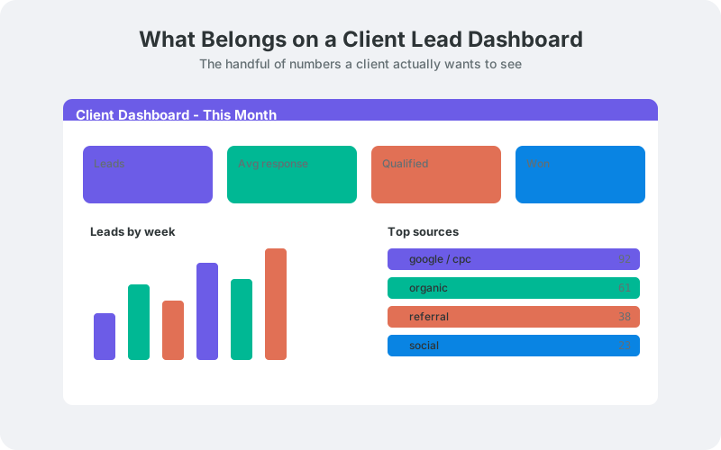
Most agency dashboards fail the opposite way. They pile on impressions, sessions, bounce rate, and raw form rows until the client cannot tell whether the campaign is working. A good dashboard answers five questions fast: how quickly do we respond, how many leads came in, where did they come from, where are they in the pipeline, and what did we win?
This guide walks each of those numbers, explains why it earns space, and shows what to leave off. It also covers how to build the thing today in a spreadsheet, in Looker Studio, or through a branded client portal. The goal is one screen a client reads in a minute.
Why Is Response Time the Headline Metric?
Response time belongs at the top because it is the number a client can act on and the one that most directly moves revenue. An audit of 2,241 U.S. companies found firms that answered a web lead within an hour were nearly 7x more likely to qualify it than those who waited an hour, and 60x more likely than those who waited 24 hours or more (Harvard Business Review, 2011).
The effect is steep even inside a single hour. Within that first hour, the odds of contacting a lead drop by more than 10x and the odds of qualifying it by more than 6x (InsideSales.com / MIT Lead Response Management Study, 2007). Minutes matter more than most clients realize, so the dashboard should make delay visible.
This is not a small sample. The study analyzed three years of data across six companies, more than 15,000 leads and over 100,000 call attempts (MIT Lead Response Management Study, 2007). Show average first-response time, a target line, and the share of leads answered inside that target.
Citation capsule: Firms responding to a web lead within an hour were nearly 7x more likely to qualify it than those waiting an hour, and 60x more likely than those waiting a day, across an audit of 2,241 companies (Harvard Business Review, 2011). That is why speed to lead leads the dashboard. Our guide to tracking lead response time in Google Sheets shows the formulas.
Which Numbers Actually Belong on the Dashboard?
Five metrics earn a place: response time, lead volume with trend, lead source and attribution, pipeline stage with conversion, and won value. Together they answer the only question a client is really asking, which is whether the money spent is producing qualified, closeable business. Anything that does not feed one of those five answers is a candidate for the cutting room.
Think of it as a top row and a supporting grid. The top row is speed to lead, because the MIT and HBR data make it the metric with the clearest link to revenue. The supporting grid explains the top row: how many leads, from where, moving where, and worth what.
Keep the count deliberately small. A client should read the whole screen in under a minute and walk away knowing one thing to do next. The sections below take each metric in turn, then cover what to strip out.
How Should the Dashboard Show Lead Volume and Trend?
Show lead volume as a single current number with a trend line, not a raw table. A client wants to know how many leads arrived this period and whether that is up or down against the last one. One big figure, a small week-over-week or month-over-month delta, and a sparkline or bar chart carry the whole story.
Volume without trend is a vanity number. Forty leads means nothing until the client sees it against last month's thirty-two. Pair the count with a percentage change and a short time series so seasonality and campaign spikes are obvious at a glance.
Segment volume only where it changes a decision. A split by form or by service line is useful; a split by hour of day usually is not. If your data source captures submission timestamps, you can also surface the best windows to follow up. The MIT study found the strongest contact window is 4pm to 6pm, roughly 114% better than the worst block, with Wednesday and Thursday the best days to reach and qualify leads (MIT Lead Response Management Study, 2007). For chart mechanics, see building Google Sheets dashboards with sparklines and pivots.
What Attribution Data Does a Client Need?
Show which channel and which campaign produced each lead, not just a lump total. Attribution is what lets a client decide where the next dollar goes, so the dashboard should break leads down by source (paid search, social, organic, referral) and by campaign, ideally down to the UTM or click ID that arrived with the form.
This only works if the data is captured at submission time. When a form records _utm_source, _utm_campaign, and _gclid alongside the name and email, attribution becomes a simple group-by rather than guesswork. Without it, you are stuck asking the client where they think leads came from.
In our experience, the attribution table is the panel clients stare at longest, because it maps directly to spend. Keep it to source, campaign, lead count, and (if you have it) qualified count per source, so cost per qualified lead is one step away. Our guide to UTM tracking on WordPress forms covers capturing those parameters cleanly.
How Do You Show Pipeline Stage and Conversion?
Use a simple stage flow with counts and conversion rates between stages. A client dashboard does not need a full CRM funnel. New, Contacted, Qualified, Won, and Lost is enough to show where leads sit and where they stall. Put the count at each stage and the percentage that moves from one stage to the next.
Conversion between stages is where problems surface. If 40 leads become 30 contacted but only 4 qualified, the contact-to-qualify step is the bottleneck, and that usually traces back to response time or lead quality. The pipeline view and the speed-to-lead number reinforce each other.
Most reports show a conversion rate at the very end and hide the middle. Showing the drop between each stage is more honest and more useful, because it points to a specific fix instead of a vague verdict. If you score leads, a stage view pairs well with a quality signal; see the scoring and analytics docs for how a score can sit beside the pipeline.
Why Include Won Value on a Lead Dashboard?
Include won value because it is the number that ties lead activity back to money the client understands. Leads, sources, and pipeline stages are inputs. Won value (revenue, deal count, or booked jobs) is the output that justifies the retainer. Even an estimated value per won lead turns the dashboard from an activity report into a business case.
Keep it honest and simple. Show total won value for the period, number of deals won, and if you can, average value per won deal. Where clients close offline, let them enter a value against a won lead so the figure stays real rather than modeled.
Won value also closes the loop on attribution. When you can trace revenue back to the source that produced it, the client stops asking whether the campaign works and starts asking how to scale it. That single connection, from click ID to closed revenue, is the strongest story a client dashboard can tell.
What Should You Leave Off a Client Dashboard?
Leave off vanity metrics, raw submission rows, and internal jargon. Impressions, page views, bounce rate, and follower counts do not tell a client whether they are getting qualified leads, so they dilute the screen. Raw rows belong in the underlying sheet, not on the dashboard. Internal terms like MQL nuance or attribution model names confuse more than they clarify.
Cut anything the client cannot act on. A metric that never changes a decision is decoration. If a number would not lead to a phone call, a budget shift, or a follow-up, it does not belong on the one screen a client reads in a minute.
Also resist the urge to show everything you track. You may capture IP, page URL, timestamps, and consent flags, and those matter for compliance and debugging, but they are operational data. Keep the client view to the five metrics above and link deeper detail behind them for anyone who wants to drill in.
How Do You Build This Dashboard Today?
Build it on top of a clean lead sheet, then visualize in Google Sheets or Looker Studio. The dashboard is only as good as its data source, so start by getting every submission, with its UTM and click ID, into one structured sheet. SheetLink Forms sends WordPress form entries straight to Google Sheets in real time and appends _utm_source, _gclid, and timestamp metadata automatically, which gives you the raw columns every metric above needs.
From there you have two common paths. In-sheet dashboards use pivot tables, QUERY, and SPARKLINE to render volume, source, and pipeline panels; our Sheets dashboard guide walks the formulas. For a more polished, client-ready look, connect the same sheet to Looker Studio and build filterable charts.
Agencies running many clients should centralize first. Pull each client sheet into a master with IMPORTRANGE, as covered in the agency master dashboard walkthrough, so one data model feeds every client view. Response time is a calculated column: subtract submission time from first-contact time, then average it and compare to your target.
Ship It Per Client Without the Spreadsheet Overhead
The fastest path to a per-client dashboard is a portal that ships these metrics ready-made. Spreadsheets and Looker Studio work, but they need building and maintaining for every client, and clients still touch a Google file. A branded portal gives each client their own sign-in showing exactly the five numbers that matter, with no wp-admin access and no shared sheet.
That is what LeadOps, our coming-soon client lead portal, is built to do. Each client gets a branded lead inbox with speed-to-lead tracking against a target, a New to Won pipeline, full per-lead attribution, and reports for leads by source, open pipeline, won revenue, and average response time. It runs on the same SheetLink Forms capture you already use.
Start with the data source today: get your WordPress forms flowing into a clean sheet so the metrics exist. Then, when you are ready to hand clients a dashboard instead of a spreadsheet, see the LeadOps portal and our agency overview. The core lesson holds either way: lead with response time, keep the screen small, and connect leads to revenue.
Frequently Asked Questions
What is the single most important metric on a client lead dashboard?
Response time, also called speed to lead, is the most important metric. The odds of contacting a web lead drop by 100x and qualifying it by 21x when the first call moves from 5 to 30 minutes (InsideSales.com / MIT Lead Response Management Study, 2007). It leads the dashboard because it moves revenue most directly.
How many metrics should a client dashboard show?
Aim for five: response time, lead volume with trend, source and attribution, pipeline stage with conversion, and won value. A client should read the whole screen in under a minute. Adding more metrics usually hides the story rather than clarifying it, so cut anything that does not drive a decision.
Should I show raw lead rows to clients?
No, keep raw rows in the underlying sheet, not on the dashboard. Clients want summarized answers: how fast, how many, from where, and worth what. Raw submission tables, IP addresses, and timestamps are operational data. Link to detail for anyone who wants to drill in, but keep the main view summarized.
How do I calculate response time on the dashboard?
Subtract the submission timestamp from the first-contact timestamp, then average the result and compare it to a target. Your form data source must capture the submission time automatically. Show average first-response time, a target line, and the share of leads answered inside that target. See our Google Sheets response-time guide for formulas.
What attribution data should a lead dashboard include?
Include the channel and campaign that produced each lead, ideally down to the UTM parameters and click ID. This lets a client decide where to spend next. It only works if those values are captured at submission time, so use a form tool that appends _utm_source, _utm_campaign, and _gclid to every entry.
Which vanity metrics should I leave off?
Leave off impressions, page views, bounce rate, sessions, and follower counts. None of them tell a client whether they are getting qualified leads. If a number would not lead to a phone call, a budget shift, or a follow-up, it does not belong on the one screen a client reads.
Can I build this in Google Sheets or do I need Looker Studio?
You can build it in either. Google Sheets handles volume, source, and pipeline panels with pivot tables, QUERY, and SPARKLINE. Looker Studio gives a more polished, filterable, client-ready look from the same sheet. Both need a clean lead sheet first, with UTM and click-ID columns captured at submission.
How does a client portal differ from a shared spreadsheet?
A portal gives each client a branded, password-free sign-in showing only their five key metrics, with no access to your spreadsheet or WordPress. A shared sheet exposes raw data and formulas and is easy to break. LeadOps, our coming-soon portal, ships these metrics per client on top of SheetLink Forms capture.
More Lead Management guides
Feed Your Client Dashboard With Clean Lead Data
SheetLink Forms sends every WordPress lead, with UTM and click-ID, straight to Google Sheets in real time. No Zapier, no monthly per-task fees.